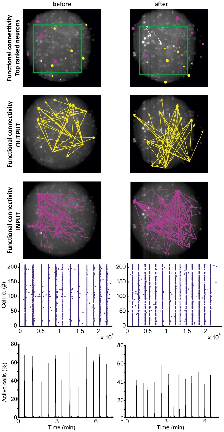
Figure 3.
Directed functional connectivity before (left) and after (right) lesion. The number of OUTPUT and INPUT functional connections has been calculated for all the imaged neurons based on the temporal correlation between the firing onsets of the neurons (see section “Materials and Methods”). The ten top ranked cells, i.e., the cells with the largest number of functional OUTPUT (yellow) and INPUT connections (pink), are represented in the top row. For graphic clarity, the connectivity graphs shown in the 2nd and 3rd rows (respectively INPUT and OUTPUT connections) include only the five top ranked cells. The data refers to a homogenous neuronal network where functional hub cells (i.e., neurons with a very large number of functional connections) were not identified. The fluorescent images show the cells loaded with the calcium indicator Fluo4 (see section “Materials and Methods”). The locations of the two lesions (L1 and L2) are marked by the white arrows. The green rectangle highlights the region shown in Figure A1. The field of view is a circular region of 244 μm diameter. The raster plot (representing the firing onsets) and the fraction of activated cells are shown respectively in the 4th and 5th row.

