Fig 2.
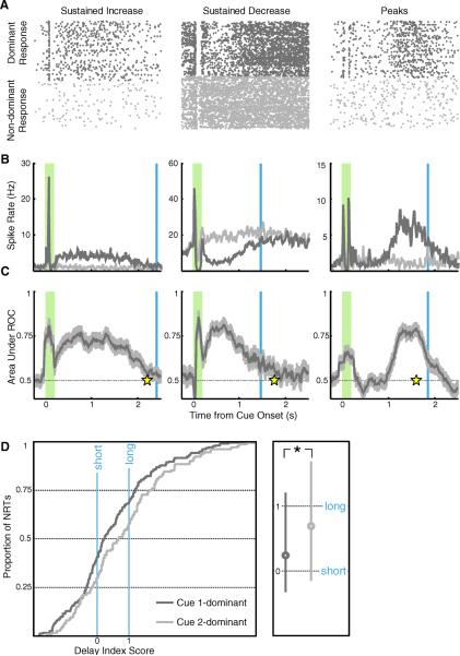
V1 neurons recorded under initial pairing. A–C) Columns contain single unit examples of each form of reward timing (left: sustained increase, center: sustained decrease, right: peaks). A) Dots represent spikes recorded from a single unit in a behavioral session, with responses to the dominant cue on top (dark gray) and non-dominant below (light gray). The raster plots are gathered from all correctly completed unrewarded trials, aligned at stimulus onset, and stacked in chronological order. B) Smoothed, average spike rates compiled across trials are shown in dark gray for the dominant response and light gray for the non-dominant (shaded green bar: cue presentation; blue line: average reward delivery following the dominant cue). C) Bin-bybin ROC analysis, comparing responses evoked in all trials of dominant and non-dominant cue presentation, provides the area under each ROC curve (dark gray) and a 95% confidence interval (light gray). For sustained increase (left) and sustained decrease neurons (center), the neural report of time (response time; yellow star) is defined as the first bin returning to chance. For peak neurons (right), the neural report of time is defined as the maximal ROC value. D) Cumulative population distributions of delay index scores are plotted on the left, where zero represents the short delay to reward and one represents the long delay. Plotted in dark gray is the population of neurons (n = 180) whose response is dominated by the cue associated with the short delay (cue 1) and in light gray the population (n = 116) dominated by the cue paired with the longer delay (cue 2). The median values of these distributions lie close to zero and one respectively, and are significantly different from one another (Mann-Whitney U test P < 0.05), indicating that the observed subpopulations accurately relate the reward times associated with their dominant cues. The boxplot on the right indicates the median values (circle) and 25–75% percentile range (line) for each subpopulation.

