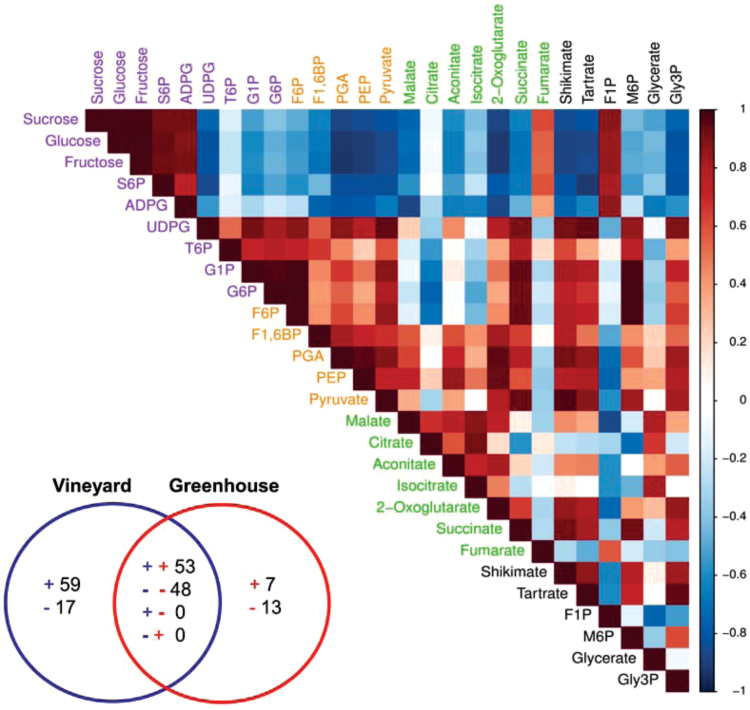
Fig. 4.
Correlation matrix of all metabolites of berries grown in the vineyard. The Pearson correlation coefficient (positive or negative) between a pair of metabolites is represented by virtual colour as indicated in the colour key. Metabolites were grouped according to their metabolic pathways. A similar matrix was built for the greenhouse-grown berries (data not shown). Comparisons between samples from vineyard and greenhouse are summarized in the Venn diagram (inset), with ‘+’ and ‘–‘ indicating significant positive and negative correlations, respectively.

