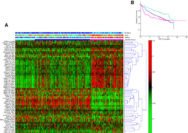
Figure 5.
Gene expression for tumours in each bicluster of known biomarkers. Panel (A): Heatmap of oncogenic pathway activity across biclusters, sorted by the proportion of tumour samples in early relapse (DFS ≤ 2 years), as for Figure 2 (A). The colour bar labelling is the same as used in Figure 2. Each row represents a gene signature and each column represents a tumour. The red colour indicates that the expression of gene is higher than the average expression across all tumours; the green colour indicates that the expression of gene is lower than the average expression across all tumours. Panel (B): Kaplan Meier (KM) plots for survival estimation of patients in first 10 biclusters (KM curve in cyan), last 10 biclusters (KM curve in magenta) and the remainder of the biclusters (KM curve in blue).

