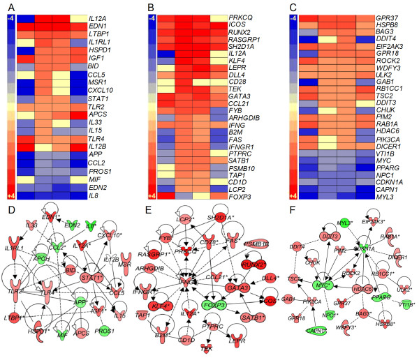
Figure 3.
Gene expression analysis of macrophage and T cell activation and autophagy networks. Intensity plot and gene interaction network analysis was derived from the SDEG at 2, 4, 8 and 12 weeks post-infection using PGS and IPA software. Intensity plot (A) and interaction map (D) of macrophage activation network. Intensity plot (B) and interaction map (E) of T-cell activation network. Intensity plot (C) and interaction map (F) of host cell autophagy induction network. The scales for intensity plots range from +3 (red) to -3 (blue) (A) or +5 to -5 (B) or +4 to -4 (C). Red symbols in networks indicate up-regulation; green denotes down-regulation of gene expression. For D, E and F, the gradation in the color intensity of gene symbols is proportional to their relative expression level at 4 weeks post-infection. The legend for D, E, and F is same as in Figure 2.

