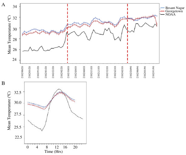
Figure 2.
Temperature reported by local weather station and within transmission sites. A. Average daily temperature over sampling period in all sites. Red lines indicate the month breaks in the data. B. Average hourly temperature profile for loggers located at transmission sites and the nearest NOAA weather station. Within transmission sites there was less cooling during the night and this resulted in higher average temperatures. Bars represent approximate 95% confidence intervals (±2 standard errors) of the mean calculated across the hourly temperature for loggers at each site.

