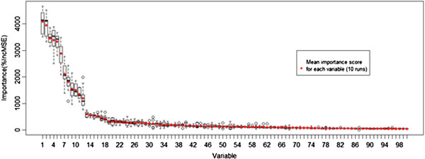
Figure 3.

Boxplots depicting the distribution of the importance score (percentage of prediction error increased when the variable is permuted randomly) of each variable, ordered by mean importance (marked with red dots) resulting from 10 runs of the model.
