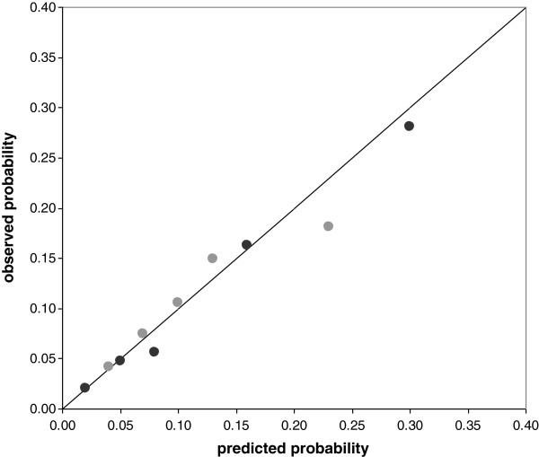
Figure 2.
Calibration plot. The figure shows probabilities of high SA predicted by the SA days model (grey dots) and the SA episodes model (black dots) with fixed regression coefficients from the development setting, and the observed probabilities of high SA in office workers per quintile of predicted probabilities; the diagonal indicates perfect calibration.

