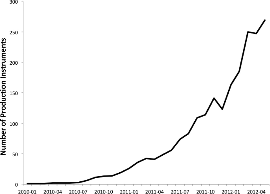
Figure 3. Library metrics.
This graph demonstrates the utilization of SDIL instruments over time. The y axis depicts number of projects that are in production consuming shared instruments from the library. The x-axis denotes time by months. The data was collected from across the consortium using routinely centrally collected utilization metrics for projects in production. The dips in the graph reflect the projects that have since been retired and rendered inactive.

