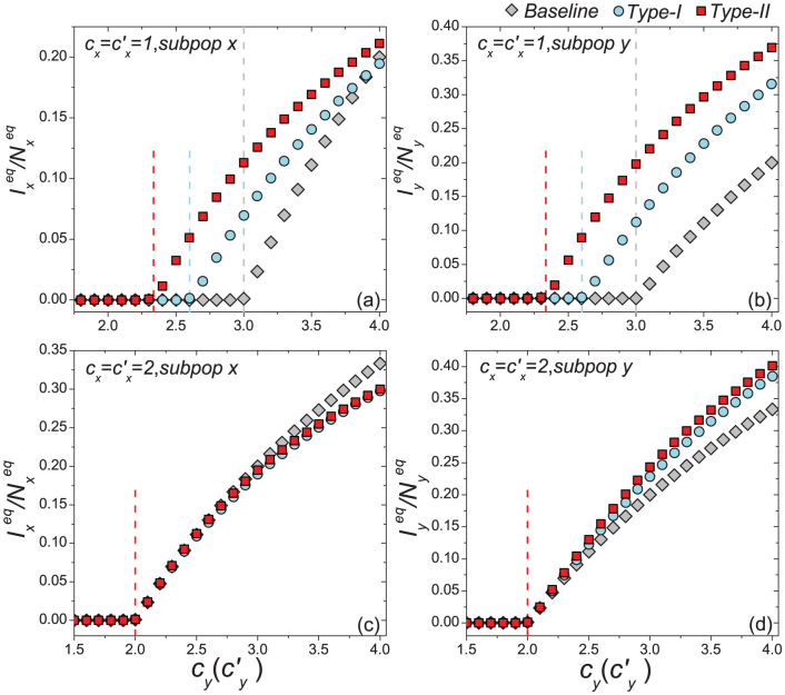
Figure 4. Comparison of the phase diagrams of  ,
,  among the baseline, type-I, and type-II scenarios.
(a)(b) show the variance of  and
and  as
as  gradually increases, fixing
  (c)(d) show the variance of
  and
and  as
as  gradually increases, fixing
  . The error bar is not shown since the standard deviation is much smaller (less than 10−1 of the mean value). The vertical colored dashed lines illustrate the theoretical prediction of the threshold of
  .
.

