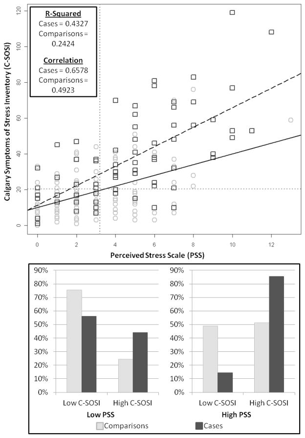
Figure 2. Perceived stress scale (PSS) scores versus Calgary Symptoms of Stress Inventory (C-SOSI) scores by case status.
Scatter plot shows the continuous PSS (x-axis) and C-SOSI (y-axis) scores for parents of children with cancer (dark gray squares) and parents of healthy children (light gray circles). The dashed black line indicates the linear relationship between these 2 scores for case parents, while the solid black line represents the linear relationship between these 2 scores for comparison parents. Gray dotted lines indicate the cut points for the PSS and C-SOSI. The bar chart depicts the proportion of case (dark gray bars) and comparison (light gray bars) parents who report low versus high C-SOSI scores among those who report low PSS scores (left chart) and high PSS scores (right chart).

