
Figure 1. Prevalence of the infection in SI epidemics.
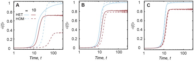
The prevalence  in case of SI epidemics for HET and HOM contact patterns with
  (blue curves) and
  (red curves). Each column corresponds to a different
  , (A)
, (A)  , (B)
, (B)  and (C)
  . The x-axis is in log-scale.