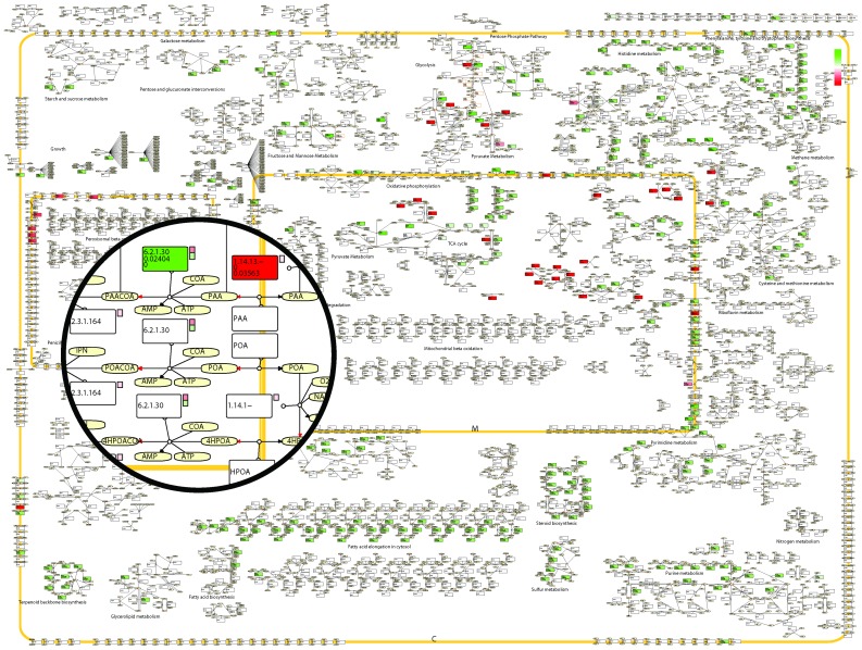
Figure 4. Example of the visualization capabilities of the RAVEN Toolbox.
The figure shows a small section of the Penicillium metabolic map, depicting peroxisomal penicillin metabolism, superimposed on the full map. Rectangles correspond to reactions and ellipses correspond to metabolites. The broad yellow line represents the peroxisomal membrane. Reactions are colored based on the log-fold change in flux between a reference and a test case, where green represents a higher flux in the test case and red a lower flux. The positive direction of reversible reactions (defined as from left to right in the model equations) is indicated by a red arrow head. For reactions carrying flux in any of the simulated cases, the flux values are printed in the reaction box. The small squares to the right of some of the reactions correspond to the log-fold change of transcript levels of the genes associated to that reaction. The gene-reaction relation is retrieved from the model structure and not implicitly specified in the CellDesigner map.

