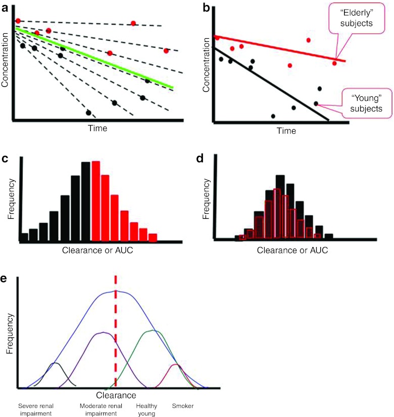
Figure 3.
Effect of covariates on variability. (a) Plot of concentrations vs. time. The solid green line denotes population average, the broken black lines denote individual averages, the red symbols represent concentration values in elderly subjects, and the black symbols represent concentration values in young subjects. (b) The solid red line denotes the population average for elderly subjects, and the solid black line represents the population average for young subjects. (c) Frequency histogram of exposures (area under the curve (AUC)) or clearances across the entire population. (d) Frequency histogram of exposures or clearances after adjusting for age. (e) A representative distribution of clearance values with underlying distributions being associated with patient factors and covariates.

