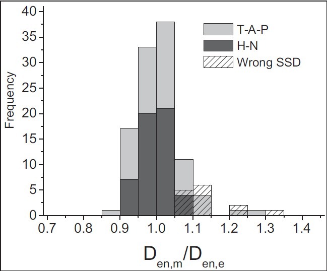
Figure 7.

Results for entrance dose measurements. The histogram shows the distribution for the ratio of measured to expected entrance doses. Light-gray bars represent T-A-P treatments (n = 106) and dark-gray bars represent H-N treatments (n = 52). Patterned bars correspond to T-A-P data, which were collected during malfunction of SSD indicator (n = 14)
