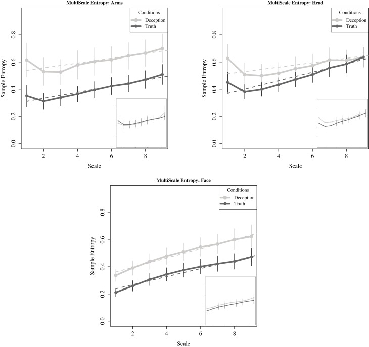
Figure 9.
For critical questions, sample entropy plotted across increasing scale lengths, i.e., lower frequencies (solid lines). Curve fitting to individual participant data was conducted using linear fit models for the three motion regions. The average intercept and slope shown here (dashed lines). Points represent mean values of sample entropy for each region, with standard error also plotted. The inset plots in each subfigure correspond to movements generated while responding to the neutral question. There are no significant differences between conditions.

