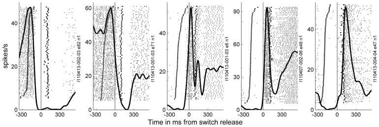
FIGURE 7.
Examples of the activity of neurons recorded during a few of the selected subsessions. Spiking data were aligned to switch release (t0) as the MRPs of the LFP. In the raster displays, each horizontal line corresponds to a trial, and each small dot to the occurrence of a spike. Trials were aligned according to increasing reaction times. In each example, the data recorded during 59–82 trials during SG–HF are shown. The first raw of large dots corresponds to the occurrence of the GO signal in each trial, and the large dots in the second raw correspond to object touch. Spiking data were averaged across all trials and represented as post-stimulus time histogram (PSTH, thick line). It can clearly be seen, that each neuron exhibits only one peak of activity, but peaks at a different moment in time around switch release.

