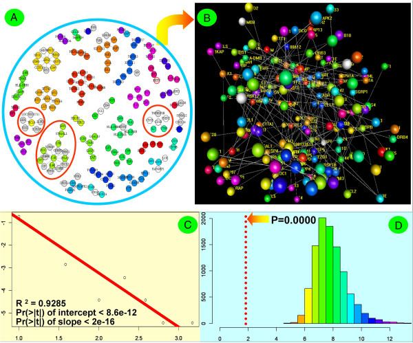
Figure 4.
Visualization and statistical evaluation of the compartmentalized network diagram. (A) 2D plot for network topological structure. The white vertices are the downregulated, differentially expressed immunogenes, and the grey vertices are the upregulated genes. (B) 3D plot for network topological structure. In this sub-scenario, balls denote vertices (immunogenes), and lines denote edges (putative regulations) between two immunogenes. (C) Test of the scale-free property of the immunogene network. The logarithmic forms of degrees and their probabilities were linearly fitted. The red line represents the best fit. (D) Test of the average path length of immunogene network. The histogram is the distribution of the average path length of random graphs from 10000-time simulations. The vertical broken red line locates at x = 1.911, and it represents the estimation of the average path length of the reconstructed immunogene network.

