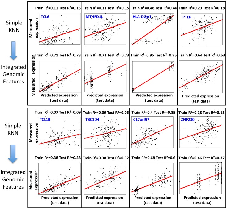
Figure 5. Examples of predictions for genes with large training R2 improvement when integrating genomic features.
Shown are the 8 genes for which the KNN algorithm that integrated genomic features resulted in the greatest R2 improvement in the training data as compared to the basic KNN algorithm. Each plot shows the expression predictions on the test data (x-axis) versus the measured expression values (y-axis), where every dot represents one of the 210 individuals. The regression curve for each plot is also shown (red curve) along with the gene name, and training and test R2 values.

