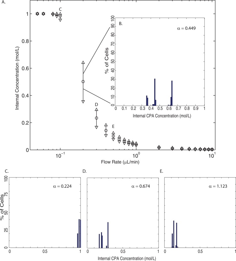
Figure 9.
(a) The internal concentration distributions over the entire cell population for each flow rate simulated. The ○ indicates the mean internal concentration, while the △ represents the maximum internal concentration, and the ▽ shows the minimum internal concentration. (b) A histogram of the internal concentration at 0.2 μl/min (). (c)-(e) Histograms of internal concentrations at 0.1 μl/min (), 0.3 μl/min (), and 0.5 μl/min (), respectively.

