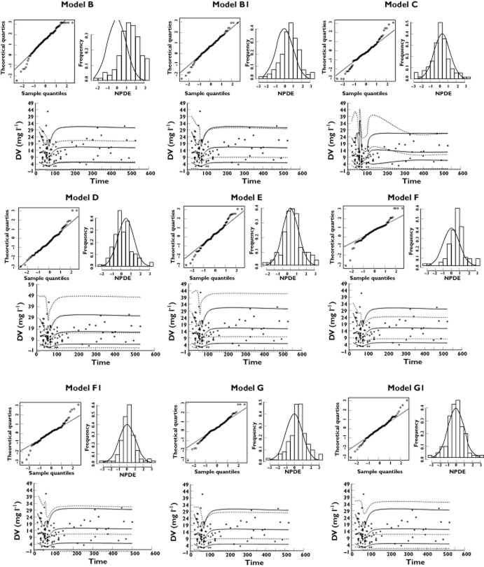
Figure 1.
Normalized prediction distribution errors NPDE and visual predictive check. NPDE: QQ-plot of the distribution of the NPDE vs. the theoretical N (0,1) distribution (left). Histogram of the distribution of the NPDE, with the density of the standard Gaussian distribution overlaid (right). Visual predictive check: observed data are plotted using a circle (○). The dashed lines represent the 10th, 50th and 90th percentiles of simulated data (n = 1000). The solid lines represent the 10th, 50th and 90th percentiles of observed data. Models B–E: the six published models. Models B1, F1 and G1: Jaffe equivalent concentrations with conversion factor of 1

