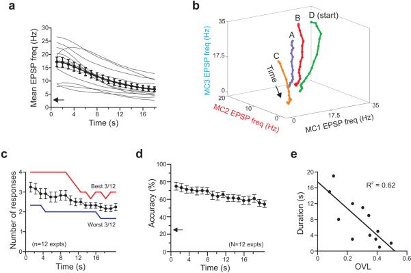
Figure 4. Time course of hilar population responses.
a, Plot of decay of average EPSP frequency during synaptic barrages in 12 experiments (thin lines represent each experiment; symbols represent overall mean ± SEM). Arrow on Y axis indicates average baseline EPSP frequency. b, Plot of centroid position as response evolves over time in one experiment (18 sliding 4-s windows). Each point reflects mean EPSP frequency in three hilar cells over a 4-s window. c, Plot of the number of statistically separable responses (out of 4 possible) versus time. Symbols represent mean ± SEM (n=12 experiments). Red and blue lines represent best and worst three experiments, respectively (see text). d, Plot of classification accuracy over time using the entire data set. Arrow along Y axis indicates accuracy expected by chance. e, The initial response overlap coefficient (OVL) is negatively correlated (R2 = 0.62; P < 0.005; F = 15.4; n = 12 experiments) to the duration responses evoked by different stimuli are significantly distinguishable.

