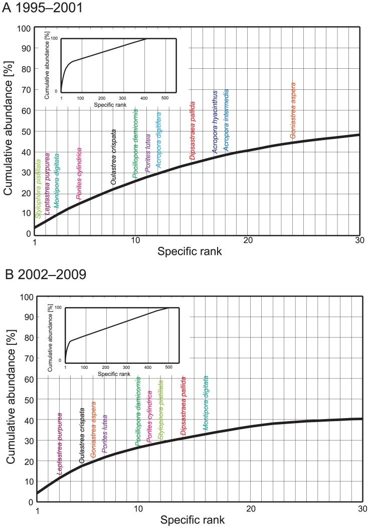
Figure 6. Specific rank in abundance from 1995 to 2001 (A) and from 2002 to 2009 (B); a comparison of rankings for the two time periods represents the effects of severe thermal stress events in 1998 and 2001.
Abundances for each species are shown in Table S3. Some notable species are shown in colored fonts. Species rank in abundance for all species (included identified species and spp.) are also shown in the figure.

