
Figure 5.
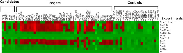
Knockout experiment results. We show the results from the knockout experiments using a graphical representation of the data. This plot was generated with Heatmap Builder [48] using the log values of the normalized gene expression measurements. The red pixels in the graph represent an over-expression of the genes in the experiment, while the bright green pixels represent under-expression. These results suggest that GFlasso correctly identified target genes that change expression due to mutations in the eQTL hotspots that were identified.