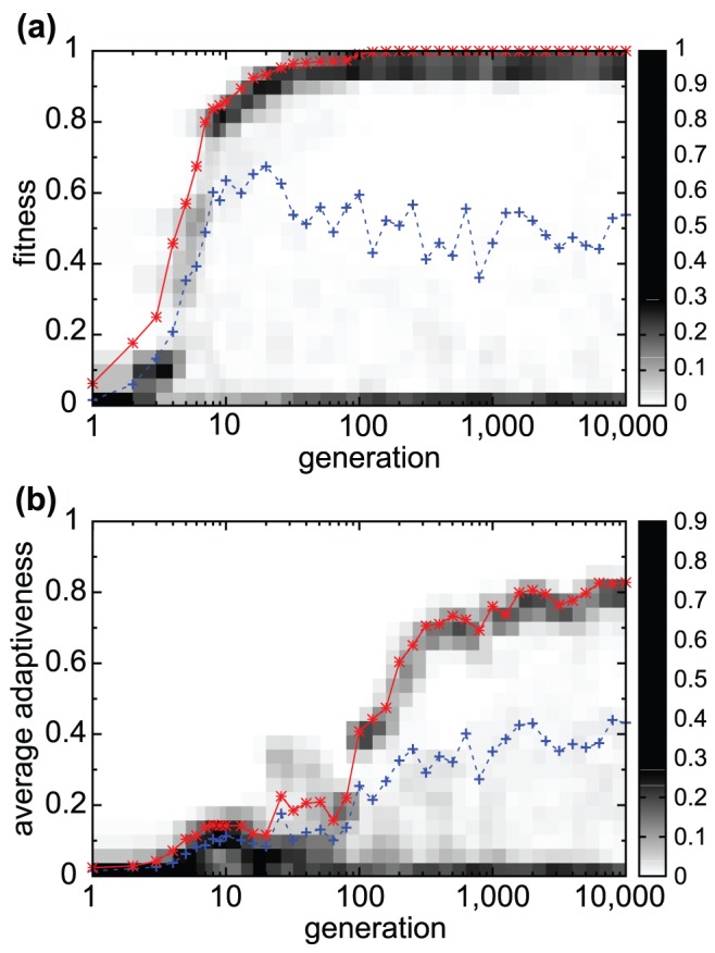
Figure 3. Evolution towards cooperative adaptive responses.

Changes in fitness values (a) and average adaptiveness  (b) over generations in the evolutionary course. Generation numbers are shown in the
  scale (abscissa). Population density distributions of fitness values (a) and average adaptiveness (b) at each generation are plotted in pixels (gray scale) according to the bar on the right side. Hence, for later generations, the distribution peaks at a high fitness (
 ) and high average adaptiveness, while another peak exists at almost zero fitness and zero average adaptiveness. The average values over surviving individuals (solid red line) and over all of the networks (dotted blue line) are also plotted. Networks with the highest (or lowest) fitness correspond to those with higher (or lower) average adaptiveness.
  ,
,  ,
,  ,
,  ,
,  ,
,  , and
, and  . In the following figures, these parameters are adopted unless otherwise mentioned.
