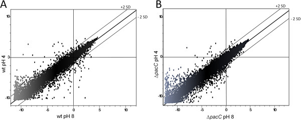
Figure 4.

Scatter plot representation of microarray data from wt (A) and ΔpacC (B) at pH 8 compared to pH 4. Each dot represents the microarray signal of the particular gene. The best-fit linear trend and the ± 2 standard deviation (SD) lines (dashed) are indicated.
