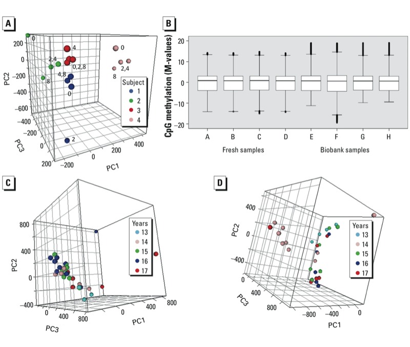
Figure 2.

Epigenomics. (A) Phase 1, PCA plot on bench times from four subjects (samples from same subjects are indicated by same symbols, labels indicate bench time in hours) (EDTA, –80oC; proportion of variance explained: PC1, 37%; PC2, 18%; PC3 16%). (B) Comparison of methylation microarray data from four fresh and four biobank samples. Box plots of the M-values after LOESS and A-quantile normalization; boxes correspond to the 25th and 75th percentiles, whiskers indicate minimum and maximum values, and circles represent outliers. (C,D) Phase 2, PCA plots on storage time (number of years) in biobank [(EPIC Italy; proportion of variance explained: PC1, 20%; PC2, 10%; PC3, 7% (C); NSHDS, PC1, 19%; PC2 13%; PC3 6% (D)].
