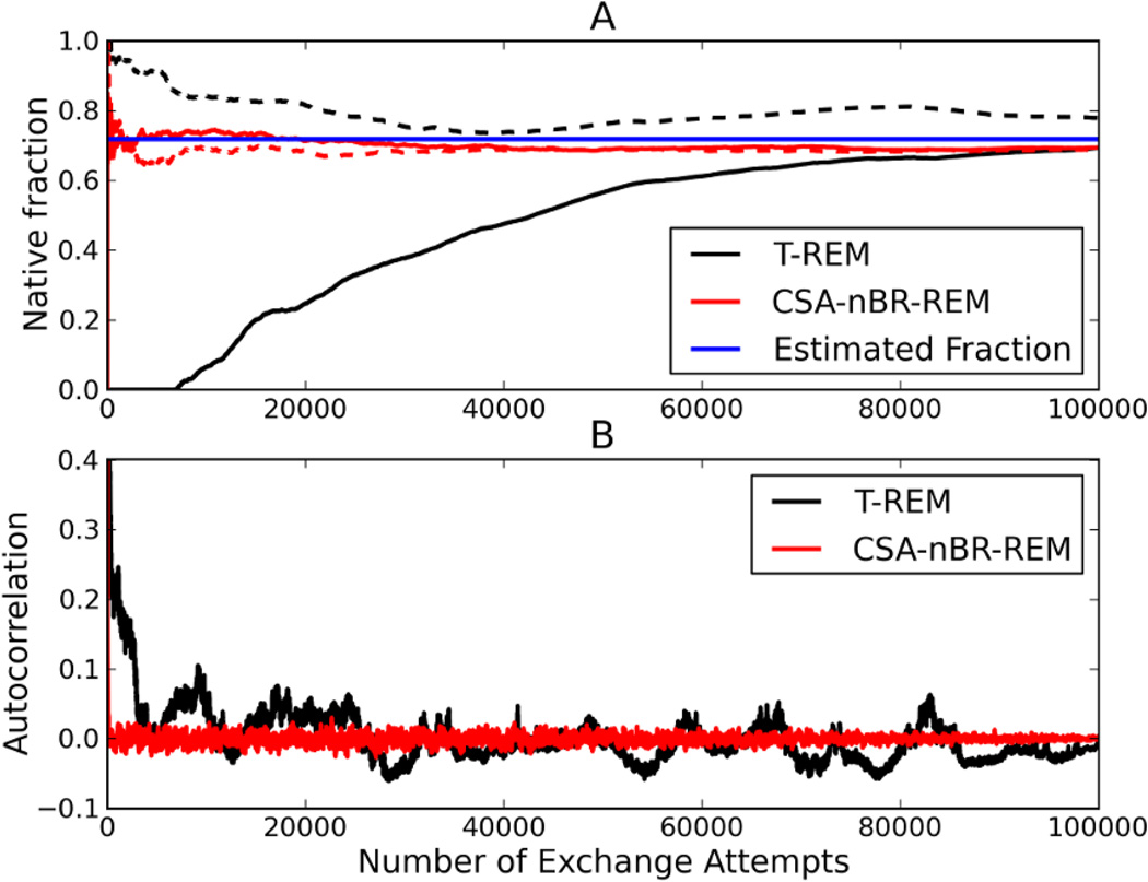
Figure 8.
Fraction Native (A) vs. number of exchange attempts for Trpcage. Black curves show the evolution of the native population via T-REM simulations and red curves show CSA-nBR-REM simulations. For both methods, solid lines are simulations starting from linear conformation and the dashed lines are those starting from native conformation. The blue line represents the average native population calculated after first the 25000 exchanges were dropped from both linear and native T-REM simulations. The end-to-end distance autocorrelation is also shown in (B) where the black curve is obtained from T-REM and the red curve is from CSA-nBR-REM simulations both starting from linear conformation.

