
Figure 3.
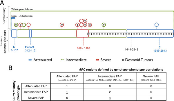
Genotype–phenotype correlation. A: Distribution of the polyposis phenotype of the index case and the presence of desmoid tumors along the APC gene. Schematic representation of the two large genomic rearrangements (top bars) and the 13 point mutations or small insertions/deletions (circles) identified in this series (including the variant of unknown significance – last circle). The asterisk inside the circles denotes patients with desmoid tumors. The lower, thick bar represents the APC regions defined by genotype–phenotype correlations proposed by Nieuwenhuis and Vasen (2007) [22]. Genotype–phenotype correspondence between our results and those previously published is indicated by concordant colors (blue/green/red/black). Numbers represent APC codons. B: Number of families presenting APC point mutations (N = 13) according to the index case polyposis phenotype and the APC codon limits, showing that five individuals (underlined numbers) presented a polyposis burden different from that predicted.