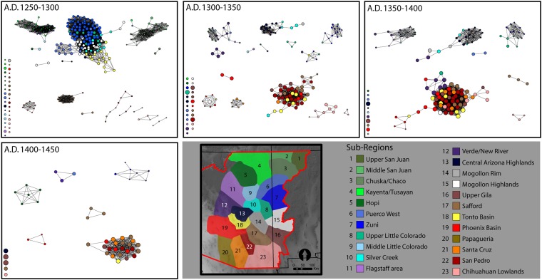
Fig. 1.
Networks of ceramic similarity through time, color coded by archaeological subregion. Network graphs display all sites for which ceramic data are available as nodes with ties defined as ceramic similarity scores ≥75% of possible similarity. The relative sizes of nodes represent relative eigenvector centrality scores for each site. Although a binary network is shown here, centrality scores were calculated based on the raw similarities among all sites in the sample. Sites with no ties as defined by the 75% similarity threshold are shown in the bottom left of each plot. These graphs show a strong and consistent division between sites in the southern (warmer colors) and northern Southwest (cooler colors). During the interval of major migration (A.D. 1250–1300), networks in the southern Southwest consist of several distinct network components with low centrality scores. Through time, networks in the southern Southwest become increasingly central and well connected, whereas networks in the northern Southwest are increasingly regionalized and less central.

