Figure 1.

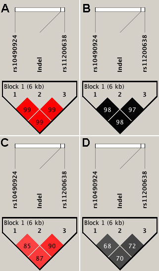
Linkage disequilibrium plots showing the three variants in the Australian and Indian cohorts. The D’ and r2 values between the SNPs are indicated inside the quadrants for the Australian (A and B) and the Indian (C and D), respectively.

Linkage disequilibrium plots showing the three variants in the Australian and Indian cohorts. The D’ and r2 values between the SNPs are indicated inside the quadrants for the Australian (A and B) and the Indian (C and D), respectively.