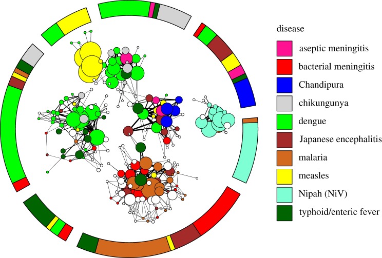
Figure 2.
Visualization of the network of diagnosed outbreaks of diseases with the potential to cause encephalitis (coloured) and outbreaks of undiagnosed encephalitis (white). The inner network describes the strength and relationship of individual outbreaks to each other, while the outer ring gives the composition of the seven communities of disease that are found by the community detection algorithm. Outbreaks of the same disease (colour) tend to cluster together. The network model acts to minimize the number of edges between outbreaks in different communities of disease and maximize the number of edges between outbreaks within a single community of disease. Each circle, called a ‘node’, represents a single outbreak report. Lines connecting two nodes indicate shared traits between two outbreak reports, in symptoms reported, the CFR or seasonality. Lines connecting two outbreaks within a single community are black, and lines between two outbreaks in different communities are in grey. Thicker lines represent a greater number of shared traits and thinner lines indicate fewer shared traits. Where nodes overlap, they are strongly connected. The size of a node (circle) representing an outbreak is proportional to the sum over the thicknesses of all edges connected to it, which can be interpreted as the amount of information contained in the outbreak report. Note that in all figures, lengths of edges and positions of nodes have no meaning as such, and have been chosen based on an algorithm for optimal visualization [24].

