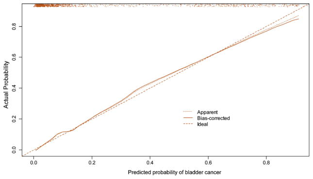
Fig. 2.

Calibration plot, where the x-axis represents the predicted probability and the y-axis represents the observed fraction of bladder cancer in 1182 patients with painless hematuria. The 45° dashed line represents ideal predictions, the solid line (bias-corrected) represents the internally validated predictions (using 200 bootstrap samples), and the dotted line (apparent) represents the uncorrected predictions. The scatter plot at the top of the figure shows the distribution of the individual nomogram-predicted probabilities.
