
Figure 4.
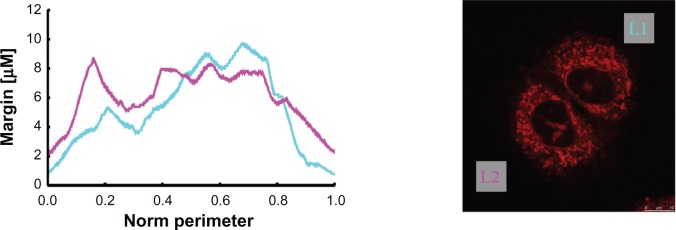
The first mitochondria margin measurement example plots describe the course of the determined mitochondria margin’s thickness (counterclockwise cycle). The cyan curve represents the upper right cell (LI)’s mitochondria margin, and the magenta curve represents that of the lower left cell (L2). Curves are plotted so that their global minimum is placed at the abscissa’s origin.