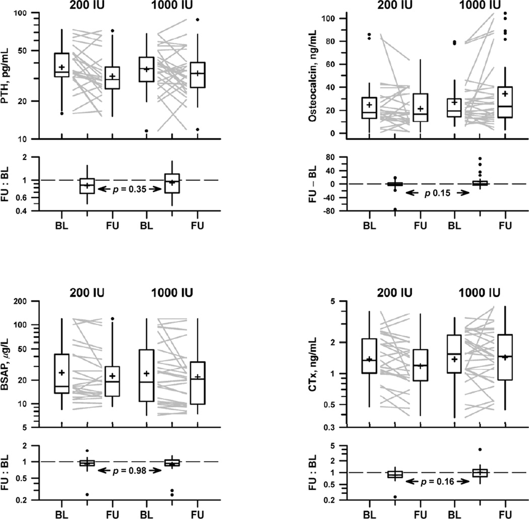
Figure 2.
Markers of bone metabolism in the 200 IU treatment arm and 1000 IU treatment arm: parathyroid hormone (upper left), osteocalcin (upper right), bone-specific alkaline phosphatase (lower left), C-telopeptides (lower right). Each subject’s marker levels are represented by a grey line connecting baseline (BL) with follow-up (FU). Box plots illustrate the distribution of baseline and follow-up levels (upper panel) and within-subject changes from baseline to follow-up (lower panel). Top and bottom of the box indicate quartile boundaries (25th and 75th percentiles); center belt indicates median; cross (+) indicates mean. Individual points (●) indicate outliers, falling outside the box by at least 1.5 times its height. Vertical lines extend to position of farthest non-outlier above and below the box. P-value in lower panel tests the hypothesis that the distribution of changes is equal in the two treatment arms.

