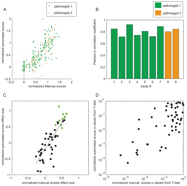
Fig. 3.
Comparisons between normalized manual and automated scores. (A) Scatter plot of normalized manual versus automated scores from the three control groups, across all studies. Two linear fits corresponding to the two pathologists who scored the studies are shown in green and in orange. Pathologist 1: fit: y=0.960x −0.053; Pearson’s correlation: 0.788. Pathologist 2: fit: y=1.075x − 0.159, Pearson’s correlation: 0.766. If the linear fit is applied to the combined manual scores from both pathologists, the fit equation is y=0.99x − 0.080; Pearson’s correlation: 0.779. (B) Individual Pearson’s correlation coefficients within studies, color-coded for those studies scored by different pathologists. (C) Scaled effect sizes for corresponding normalized automated and manual scores in animal groups from all studies: the difference between the −ve control group and test groups are shown as black circles, and the difference between the −ve control group and the +ve control group are shown as green circles. The line indicates a linear fit: y=1.656x − 0.189; Pearson’s correlation: 0.830. (D) A log-log graph of P-values for Student’s t-tests between test animal groups and −ve control groups in all studies.

