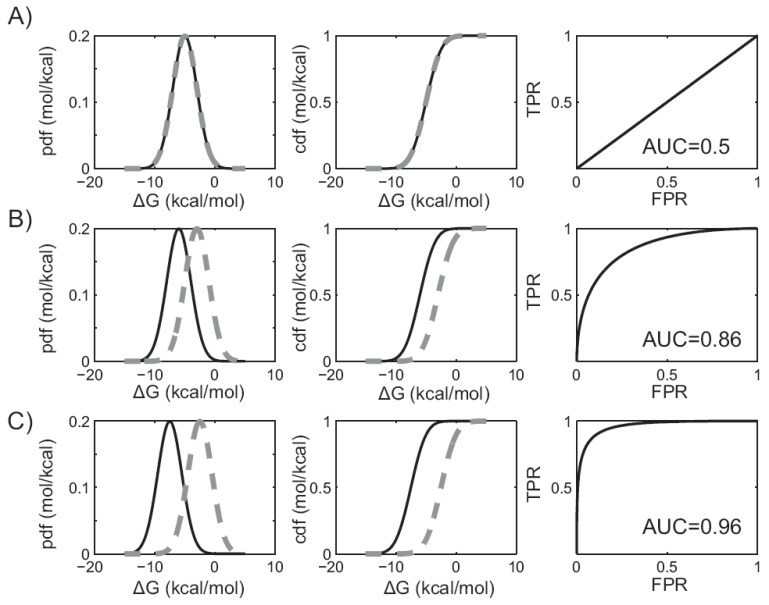
Fig. (2).
The area under the ROC curve and virtual screening performance. In figures A) through C), plots in the leftmost column describe the predicted binding affinity probability distributions. Plots in the middle column give the corresponding cumulative distribution functions. The binders are shown in solid black, while the non-binders are shown in dashed grey. Plots in the right column show the corresponding ROC curves. AUC values are shown for three different hypothetical virtual screening protocols with A) no discriminatory power, B) improved discriminatory power, or C) near perfect discrimination.

