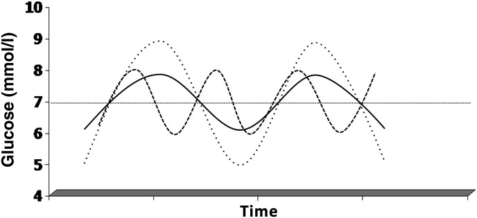
FIG. 1.
Visualization of glucose variability. Solid line: a given excursion. Dashed line: higher glucose variability due to a higher frequency of oscillation. Dotted line: higher glucose variability due to a larger amplitude. Note that the mean and area under the curve are identical in the three situations.

