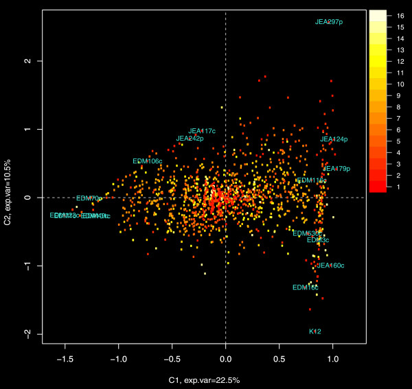
Figure 6.
Multiple correspondence analysis of the gene content matrix. The plot shows principal coordinates along the two main components. Each point on the graph represents a gene and the color of the point relates the number of genomes in which it is present. The positions of the genome labels represent the relative distances of the genomes along the respective components.

