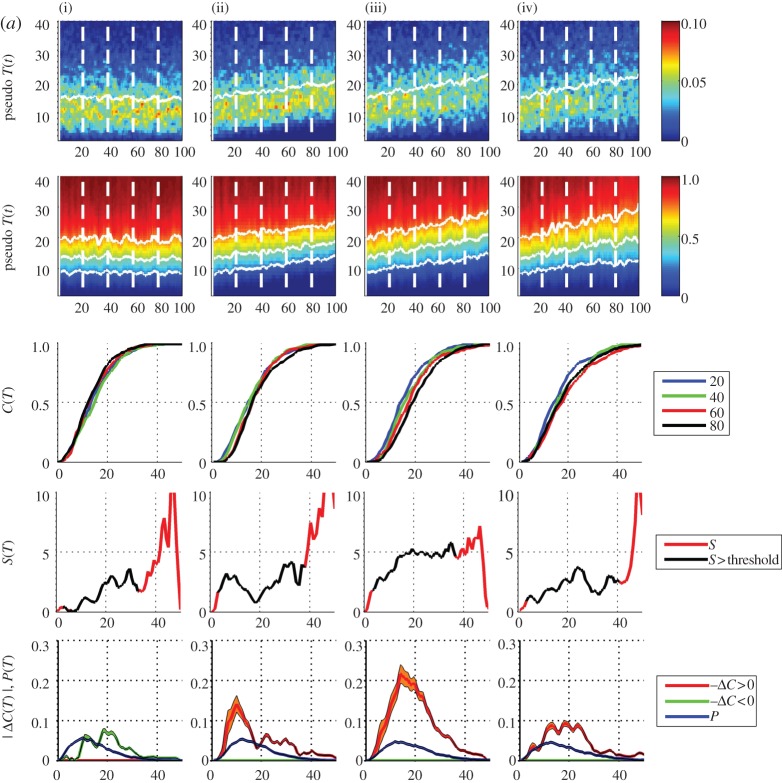
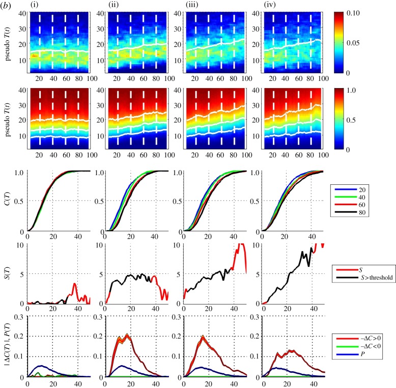
Figure 3.
(a) Pseudo-annual temperature data, (i–iv) and top three rows are as figure 2 except that the pdfs and cdfs are τ=3 ‘year’ aggregates (300 samples). The fourth row plots the local trend parameter with temperature as abscissa (red line); this is overplotted with a black line, where both pdf and |ΔC| values exceed a threshold (black line). The bottom row plots the pdf from aggregate over the entire dataset (blue line) and −ΔC (orange line) and +ΔC (green line) from the 3 year aggregates; histogram uncertainties are indicated by shading, estimated as  where m is the number of samples per pdf histogram bin. (b) Pseudo-annual temperature data, as per (a) except with τ=9 year aggregates. (Online version in colour.)


