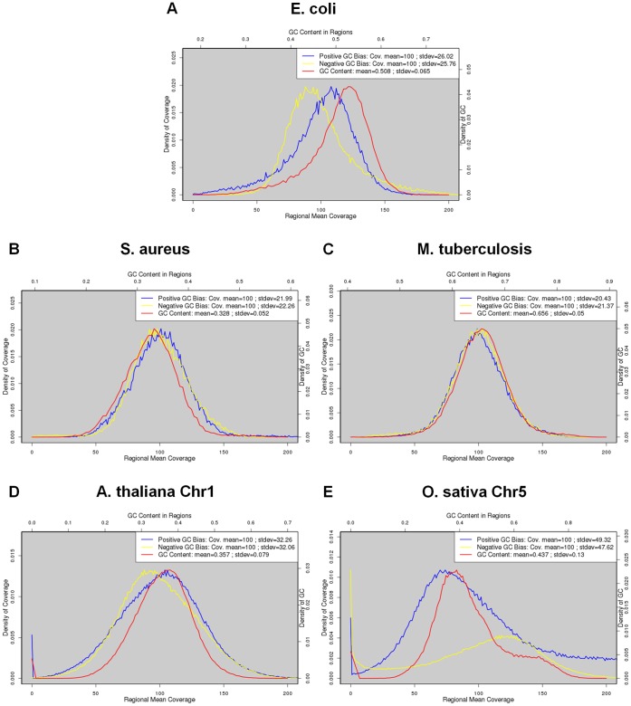
Figure 10. Distribution of GC contents and read coverage of the five species under study.
The red curves stand for GC contents (scale in top axis). The blue and yellow curves represent read coverage at a strong positive and strong negative GC bias, respectively (scale in bottom axis). We used the data at 100X coverage for the five species.

