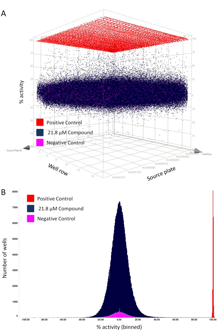
Figure 5. The SKN-1 assay performed well in uHTS.
Data from all >364,000 wells of the entire MLSMR library screen are plotted as a 3D scatter of individual points (A) and as a frequency histogram (B) to visualize distribution of % activity. (A and B) Positive controls (red) received no acrylamide and no compound. Negative controls (pink) received acrylamide but no compound. Compound wells (dark blue) received acrylamide and compound (21.8 µM). All wells received worms and buffer. Data were normalized in each plate so that the average GFP/RFP signals for negative and positive controls are 0 and 100%, respectively. Therefore, 100% activity corresponds to complete inhibition of Pgst-4::GFP induction, 0% activity corresponds to no inhibition of Pgst-4::GFP induction, and a negative % activity corresponds to greater induction of Pgst-4::GFP. (A) A 3D scatter plot of % activity (y-axis) for each well versus well row (x-axis) and source plate (z-axis) shows that the majority of compounds (dark blue) had activities between −25% and 25%, similar to the negative control wells that received acrylamide but no compound (pink). Note that many compounds reduced GFP/RFP ratios between 35 and 100%. (B) The frequency histogram was generated by dividing the entire range of % activity of the screening campaign (from −235% to 102%) into 845 equal “bins”. The total number of wells that fell within each bin was then plotted on the y-axis versus % activity. The % activity of compounds (dark blue) forms a normal distribution overlapping with the negative controls (pink). (A–B) Note that 16 data points with % activity less than −100 are not shown in either of the plots; these compounds could have either further activated Pgst-4::GFP, strongly reduced Pdop-3::RFP, or were fluorescent artifacts.

