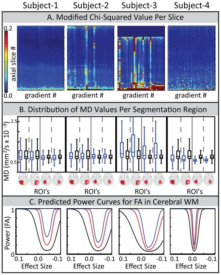
Figure 4. Comparing three pieces of the QA report for four subjects.
Each piece is selected from a different page of the report. Subject 1 and subject 2 are from Study II and are the same subjects in Figure 1. Subject 3 is from Study I and subject 4 is from Study IX. (A) Colorplot of . Within each colormap, one column represents an entire normalized diffusion weighted volume, and each row represents the same axial slice. High
  correspond to poor data with 0.2 being definitively bad. (B) MD distributions for four segmented regions, left cerebellar gray matter (GM), right cerebellar GM, left cerebellar white matter (WM), and right cerebellar WM. Blue boxplots indicate the distribution of each subject’s MD value while the black box-plot is the reference data from the multi-modal study. (C) Power curves for theoretical sample sizes of n = 5 (black), n = 15 (red), and n = 30 (blue). Curves include bias estimates and pertain to voxels in the cerebral WM.

