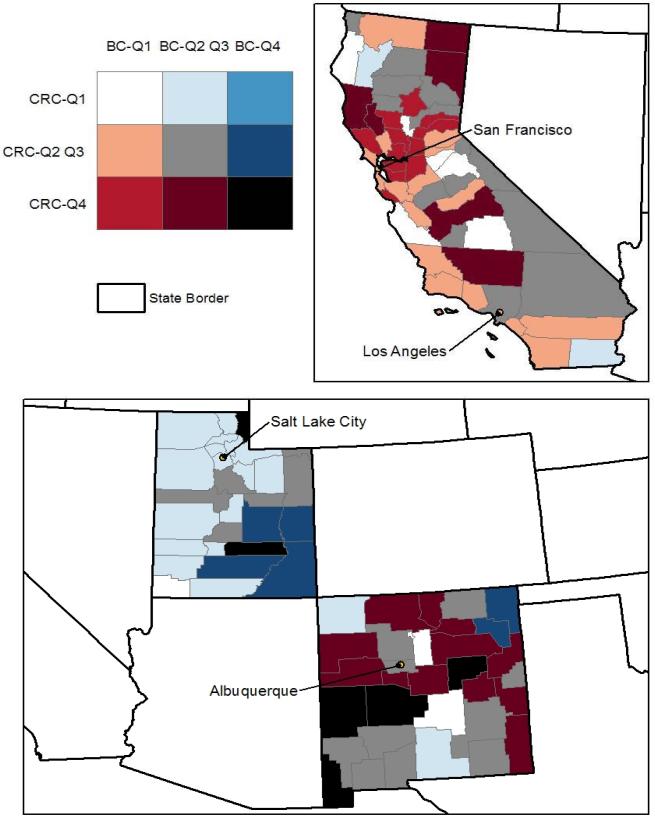
Figure 2. Predicted County Rates of Late-Stage BC and CRC in California, Utah, and New Mexico.
The counties colored black, bright red, bright blue, and white (the four corners of the bivariate legend) are of most interest. Counties colored white have predicted rates of late stage BC and CRC (both) in the lower quartile (Q1) of the distribution across all counties in the 11 states. On the other extreme, counties colored black have predicted late-stage cancer rates for both cancer types that are in the upper quartile (Q4) of the distribution. The bright red color indicates that BC rates are in the lower quartile while CRC rates are in the upper quartile, while the bright blue color indicates that BC rates are in the upper quartile while CRC rates are in the lower quartile. Generally, the red colors signal concerns for CRC while the blue colors signal concerns for BC.

