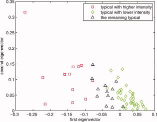
Figure B6.

On the basis of the results shown in Figure B5, and considering only the typical subjects that satisfied the condition e 2 > 0, this plot reflects the subjects' distribution based on intensity. The red squares are those subjects whose intensities are higher than the mid point of the intensity range of the analyzed population's means; green diamonds are the ones that are lower than the mean activation intensity of these typical subjects. That is why the −0.1 value for e 1 was chosen as the primary cluster threshold for the higher intensity group and 0 for lower intensity group. Combined with the results given in Figure B2 through Figure B5, e 1 < −0.1 and e 2 > 0 were chosen as the boundary for primary cluster 2 (the higher intensity typical group), e 1 > 0 and e 2 > 0 were chosen as the boundary for primary cluster 1 (the lower intensity typical group). [Color figure can be viewed in the online issue, which is available at wileyonlinelibrary.com.]
