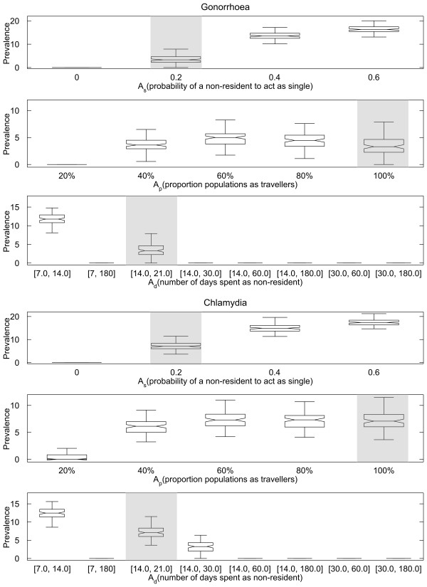
Figure 3.
The prevalence of gonorrhoea and chlamydia at 60 years after introduction of STI under different As(with Apand Adat their baseline values, first and fourth rows), Ap(with Asand Adat their baseline values, second and fifth row) and Adrange (with Asand Apat their baseline values, third and sixth row). Each box represents the 25th-75th percentiles for 100 simulations. The centre line in each box indicates the median. The maximum whisker length is 1.5 times the width of interquartile range (corresponds to approximately 99.3% coverage if prevalence at steady state is normally distributed), and outliers are not plotted. The notch in each box represents the comparison intervals such that two medians are significantly different at the 5% significance level if their intervals do not overlap (see McGill R, Tukey JW, Larsen WA: Variations of Box Plots. The American Statistician 1978, 32:12–16). The baseline scenario is highlighted in shade for all rows.

