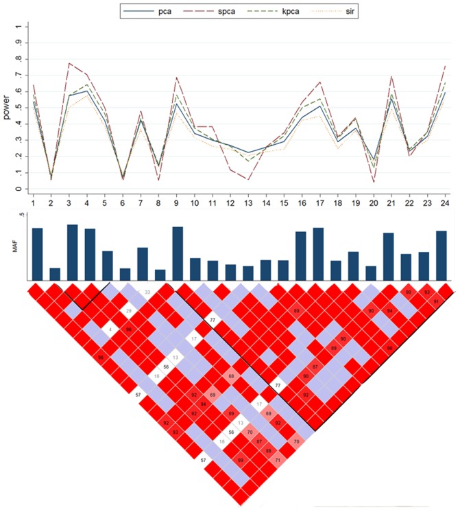
Figure 4. Powers of the causal SNP in Scenario C2 based on the XRCC1 gene.
The top plot shows the power (y-axis) of each method over the locations (x-axis) of the causal SNPs. The bar-plot shows the MAFs of all SNPs. The LD structure of the 24 SNPs is shown by the heat plot in the bottom of the figure, in which the red scale indicates the value of R2 (1 = red, 0 = white).

