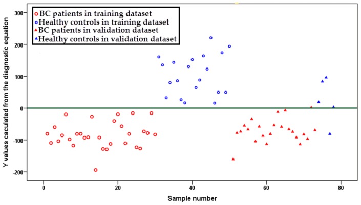
Figure 3.
Scatter plot for y-values calculated from an established breast cancer versus healthy control diagnostic equation. Samples in blue represent healthy controls, while samples in red represent breast cancer patients. Samples represented by circles indicate the training samples and triangles for the validation ones.

