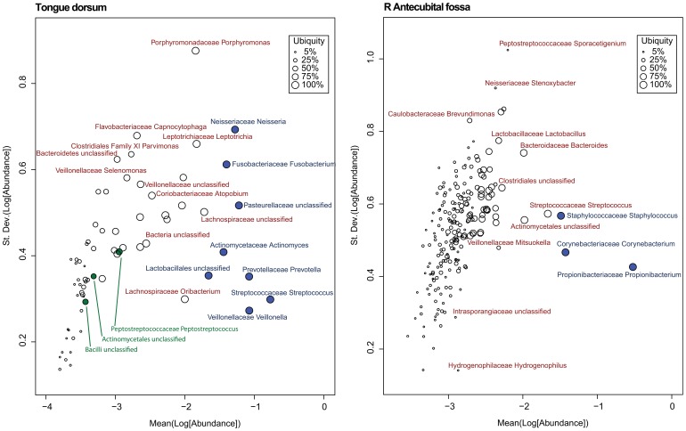
Figure 5. Variation of Abundance Plot.
In these Var-Ab plots, the abundance is along the x-axis, and the variation is along the y-axis, with both measurements increasing towards the top right of the plot. Each glyph represents a single taxon, and its size is proportional to the ubiquity of the taxon, thus the larger the glyph, the more ubiquitous the taxon is across the cohort. Those taxa that were previously selected as core at 80% ubiquity and 1% abundance have been filled in with blue, and the minor core have been filled in with green. Taxa towards the top of the plot have greater variation than those on the bottom.

