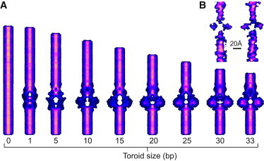
Figure 7.

Predicted density maps compared side by side with experimental data. (A) Predicted maps for different-sized toroids. (B) Two orthogonal cross sections of the experimental cryo-EM density map (11). (Yellow and dark blue) Regions of highest and lowest intensity, respectively. Rotational averaging of the conformation was performed using UCSF CHIMERA (36). Consistent with the experimental results, the color scale is determined by scaling the highest intensity bin relative to the lowest intensity bin (see Methods).
